
Your booking page is often the first thing a client sees after clicking your link, so it should match the rest of your brand. DaySchedule ships with more than 40 color themes, and each one works in light and dark mode. This article covers the eleven that work best for most businesses, with a screenshot of each one on a real booking page.
We analyzed thousands of appointment booking pages to identify the themes and designs businesses actually use. Explore the 11 most popular styles to find inspiration and choose the right look for your booking page.
Change theme
A theme changes the colors of the booking page: background, cards, borders, buttons, badges and the selected date in the calendar. It does not change the layout, fonts or the information on the page.
You can change your page them from Pages > Appearance tab.
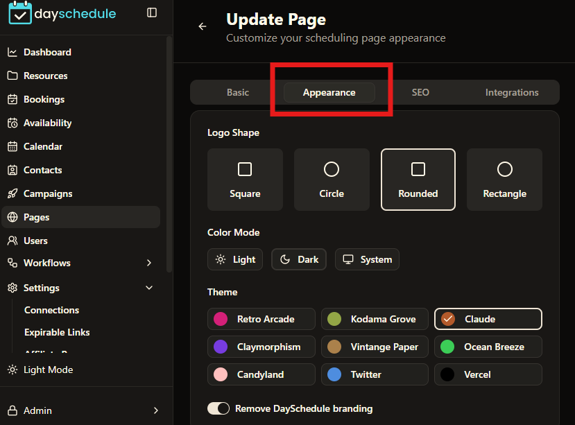
The theme and color mode (Light, Dark or system) are saved with your booking page, so every visitor sees them by default. On desktop and tablet screens, visitors can also open the palette icon in the floating menu at the bottom of the page and pick a different color or mode for themselves. Their choice is stored in their browser only and does not change your page. If you update the page later, your saved theme takes priority again.
The floating menu is hidden on phones, so mobile visitors always see the theme you configured on the page settings.
Modern Minimal
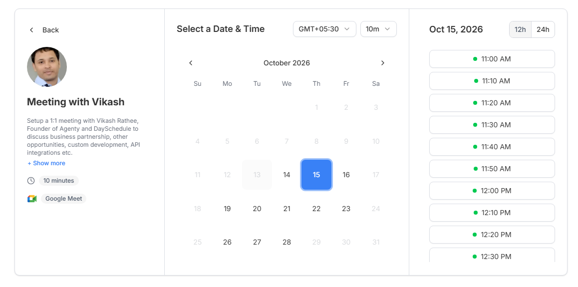
A white page with light gray borders and a clear blue accent on the selected date, the “Show more” link and focus states. The event duration and location badges stay neutral gray, so the blue only appears where the visitor needs to act.
This is the safest choice if you are not sure what to pick. It looks at home next to most company websites and reads well on small laptop screens.
Vercel
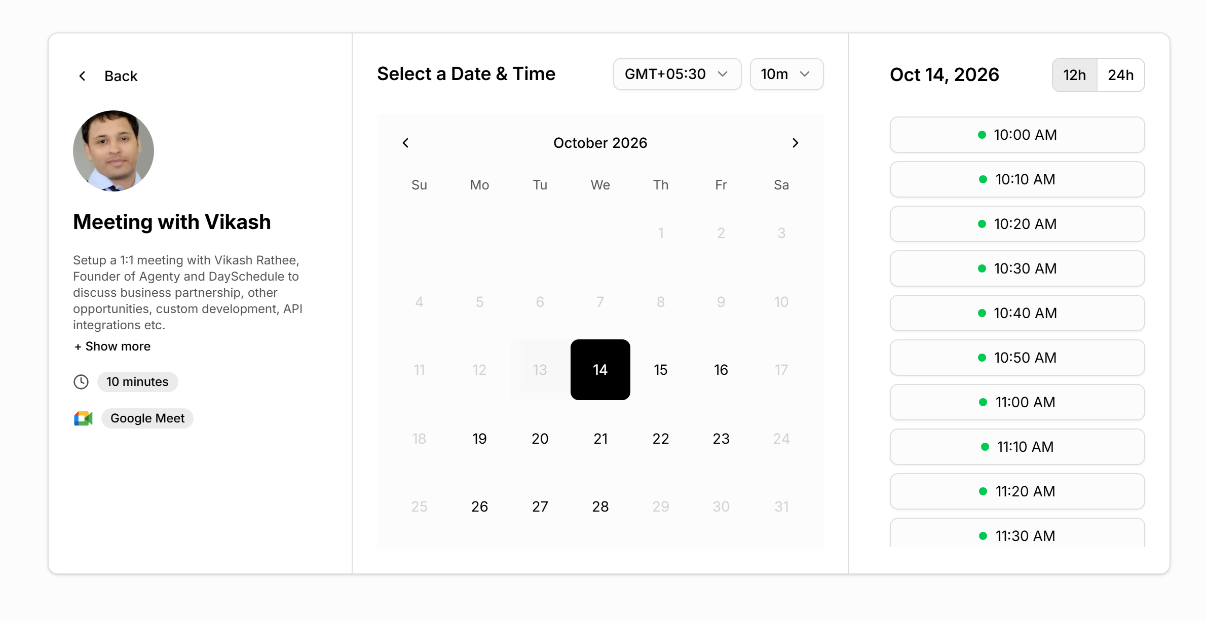
Pure black and white. The selected date is a solid black block, badges are light gray, and there is no accent color at all. In dark mode it inverts to a black page with a white primary color.
Pick Vercel if your brand is monochrome or if you want the booking page to feel like a developer tool. The lack of color also keeps attention on the time slots.
Claude
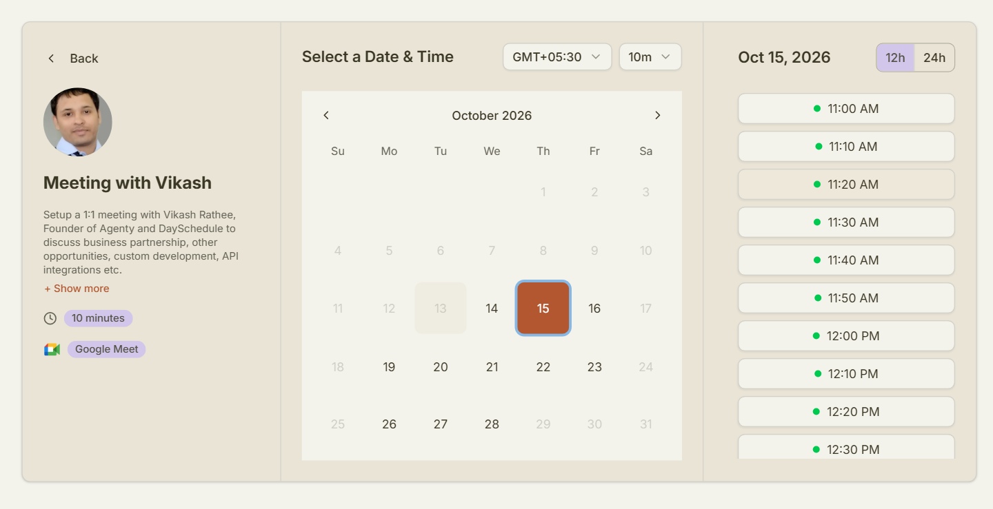
A warm cream background with a terracotta selected date, terracotta links and soft lavender badges. The calendar sits on a slightly lighter panel, which separates it from the profile column without adding hard borders.
The warmer palette feels less corporate than the blue and gray themes. It suits one-on-one services where clients should feel relaxed before the call, such as coaching or therapy.
Ocean Breeze
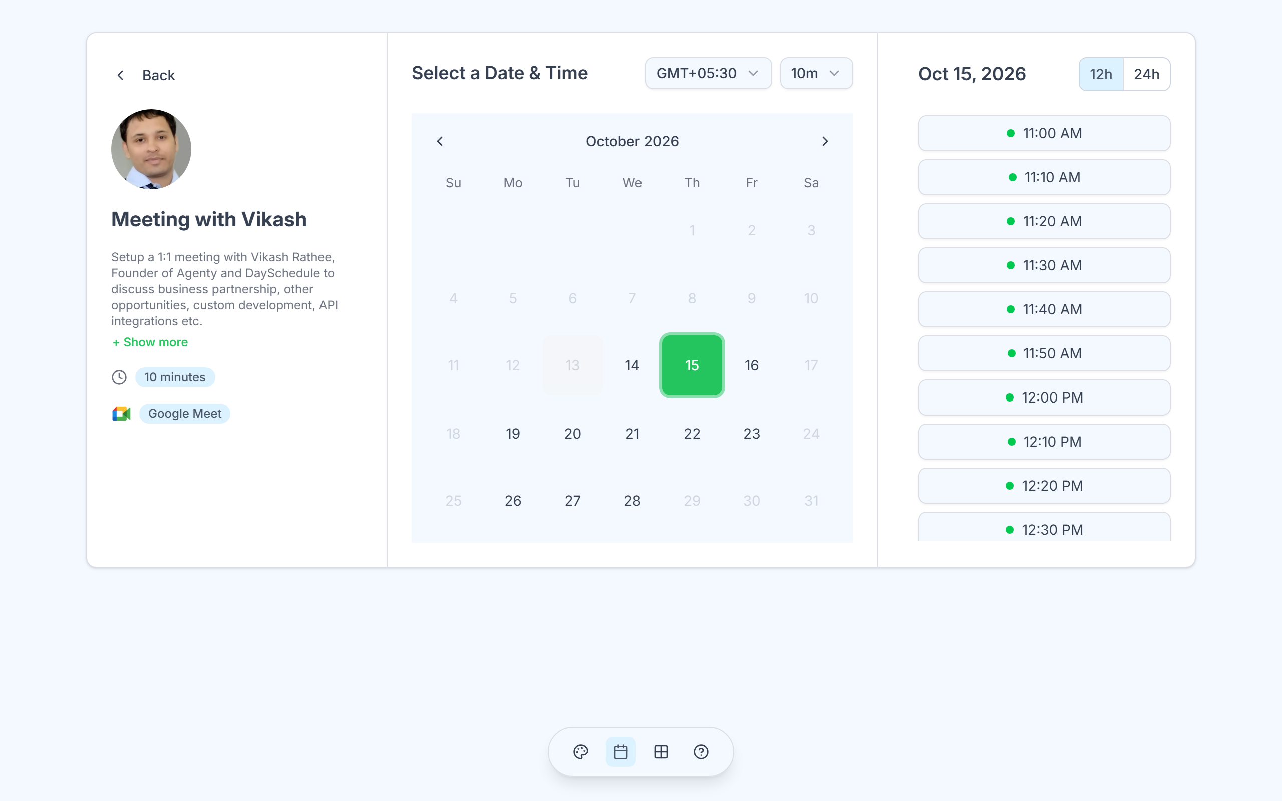
A pale blue page background with a white card, a green selected date and light blue badges. The 12h toggle and calendar panel pick up the same soft blue.
Green and blue read as calm and healthy, which makes this a good match for clinics, dentists, physiotherapists and wellness brands.
Supabase
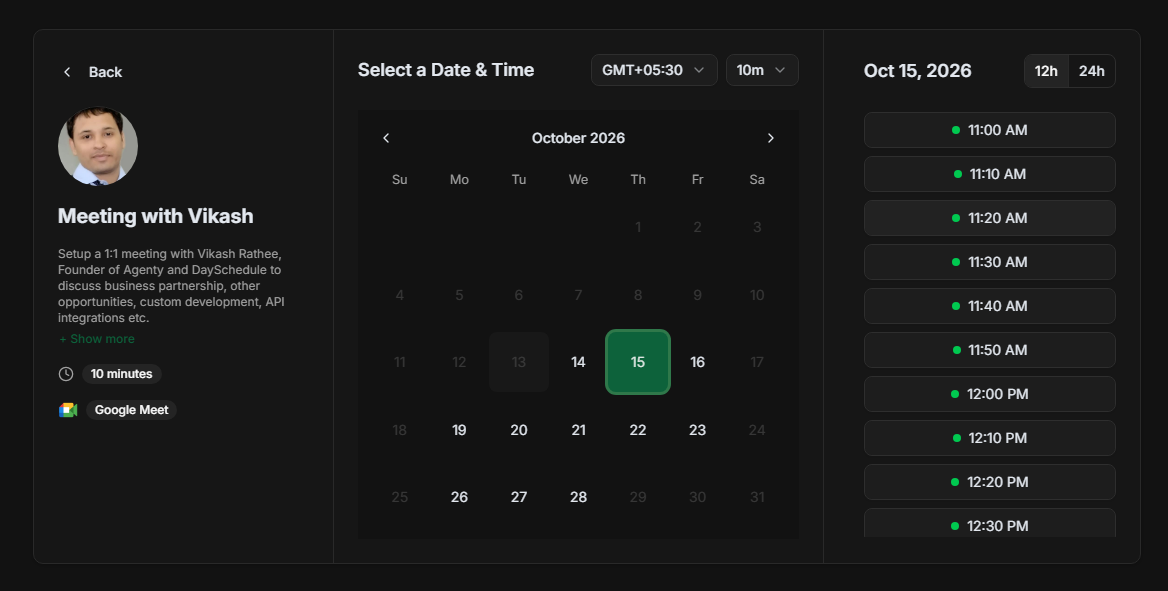
Near-black background, dark gray time slots and a Supabase green selected date with a brighter green outline. Text is bold white, so the appointment booking page stays readable even at the small scale.
Use it in dark mode for technical demos, onboarding calls for developer products, or any brand that already uses a dark site.
Neo Brutalism
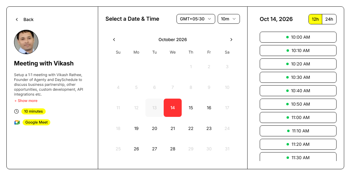
Thick black borders on every card, time slot and dropdown, a bright red selected date and highlighter-yellow badges and toggle. It is the loudest theme in this list.
Neo Brutalism works when you want the booking page to stand out, for example for design studios, creative agencies or a personal brand with a strong visual style. It is probably too much for a law firm.
Elegant Luxury
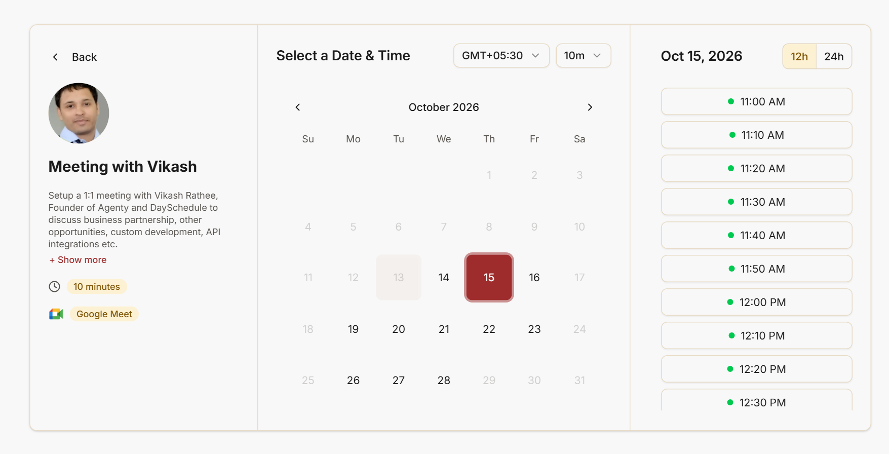
An off-white background with thin beige borders, a deep burgundy selected date and pale gold badges. The red is dark enough to feel refined rather than urgent.
Good for salons, spas, real estate agents, jewelers and any service where the price point is high and the page should feel premium.
Cosmic Night
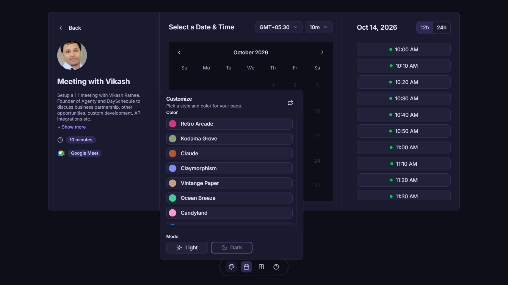
Deep indigo background with violet links and an indigo 12h toggle. This screenshot also shows the Customize popover that visitors see when they click the palette icon: a list of colors and a Light and Dark switch under Mode.
Cosmic Night is a good dark theme when Supabase or Catppuccin feel too technical. It fits music teachers, gaming coaches and anyone who takes bookings in the evening.
Kodama Grove
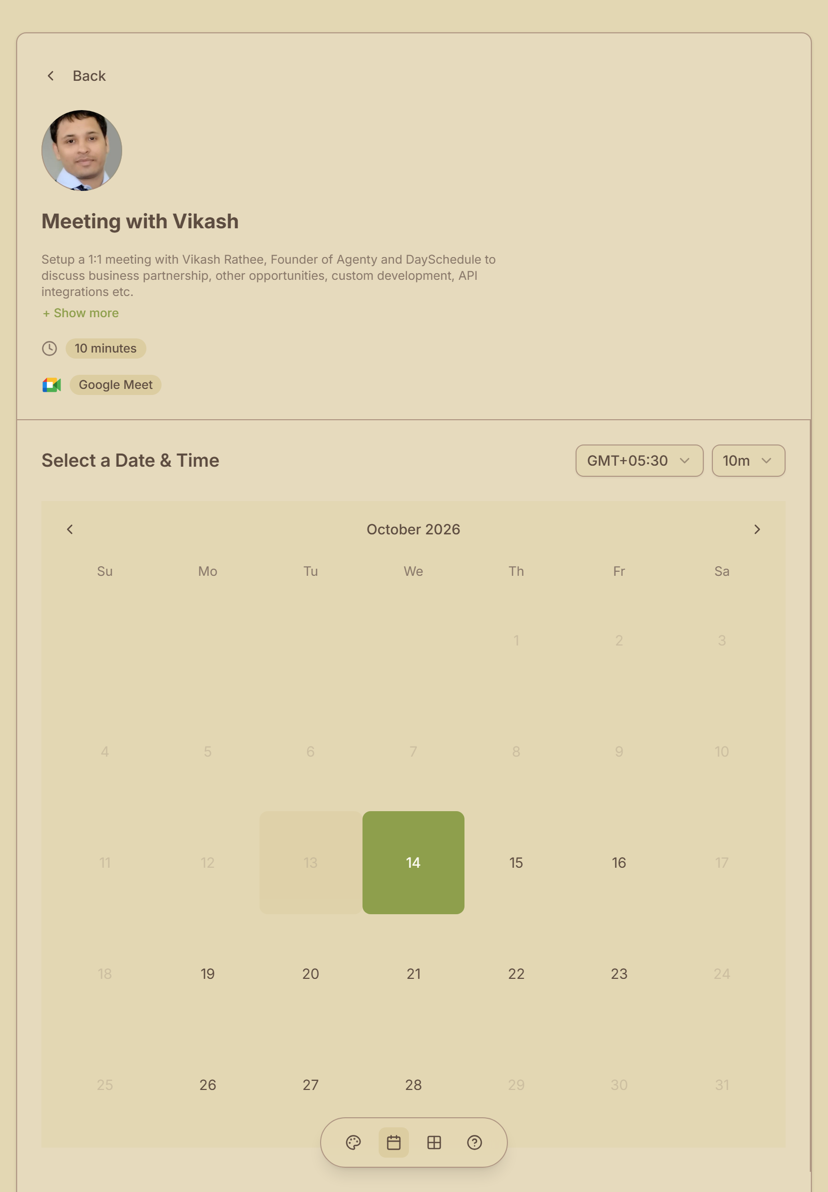
A parchment-colored page with brown text, olive green as the primary color and tan badges. Borders are a muted brown instead of gray.
This screenshot was taken on a tablet in portrait (820 x 1180). At this width the profile section moves above the calendar, and the earthy colors still look consistent across both sections. It suits yoga studios, farms, outdoor guides and eco-friendly brands.
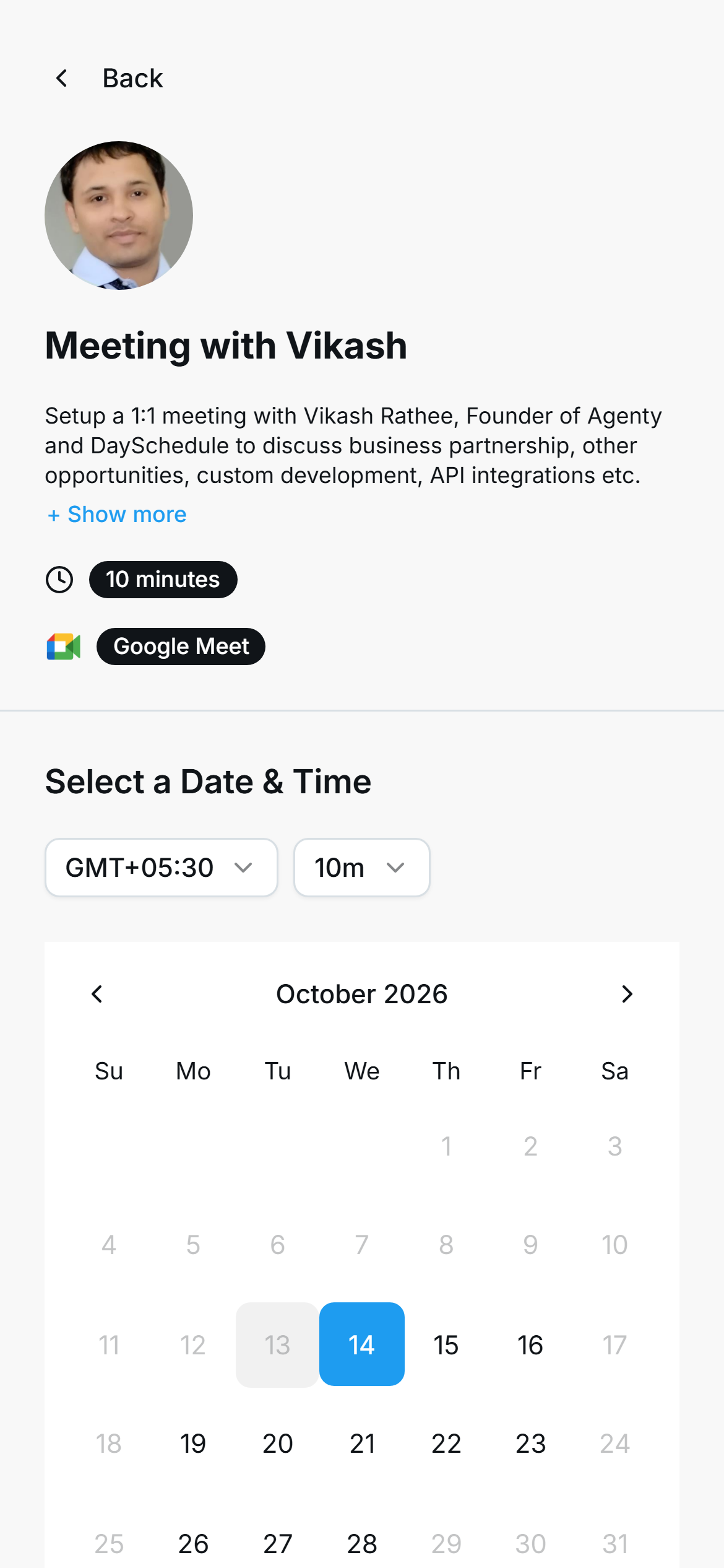
A light gray background, Twitter blue for the selected date and links, and solid black pill badges for the duration and location.
On a phone (390 x 844 above) the high contrast badges are easy to read at a glance. It is a good pick for social media managers, creators and anyone whose audience comes mostly from mobile.
Catppuccin
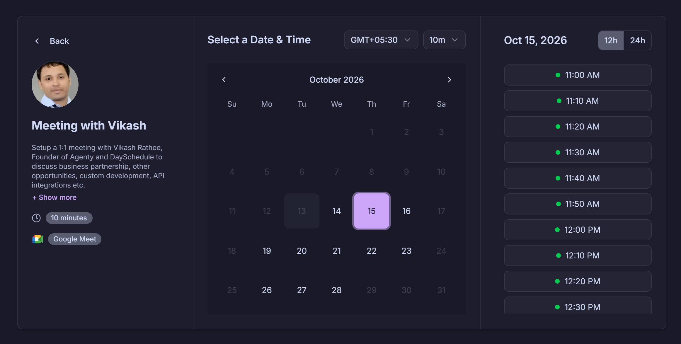
Dark navy background, slate gray badges and time slots, and a soft mauve selected date. The pastel accent is easy on the eyes in dark mode while still making the selected date obvious.
Catppuccin is popular with developers who already use it in their editor or terminal, so it fits developer communities, open source maintainers and streamers.
Picking a theme
Start with the color closest to your logo or website. If you have a dark website, choose one of the dark themes (Supabase, Cosmic Night or Catppuccin) and set the mode to Dark so visitors do not get a light page first.
Check the page on your phone before sharing the link. Mobile visitors cannot switch themes, so the one you save is the one they see.